Friday, 11 November 2011

Retrospective

A Final Word.....

During the final presentation I was made aware of some issues that would benefit from further resolution. In light of this I have reviewed two areas, firstly modification of the main entry to give it more prominence and secondly investigation into how adjusting levels may help accentuate the appearance of the building merging into the landscape - which would also create further interest into the interior experience of the building. The level adjustments are proposed to the community and governance wings only. Below are sketches illustrating my thoughts on these two areas.

Issue 1 - Entry prominence


 Sketch 1 - Plan - Modification to Entry


 Sketch 2 - Long Section - Modification to Entry


Issue 2 - Level adjustments


Sketch 3 - Long Section - Level Adjustments


Final Presentation Panels

Panel 1


Panel 2

Operational Details

Following are conceptual operational details for two parts of the Unified Capital building:


Operational Detail 1 - Adjustable stage in the Unity Hall


Operational Detail 2 - Natural ventilation strategy for the Unity Hall


Perspective Renders

Following are the perspective renders for the Unified Capital building.


Render 1 - Site context with OGH in the background


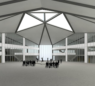
Render 2 - Unity Hall - Community Event - Notice the stage is in the up position


Render 3 - Unity Hall - Governance Event - Notice the stage is in the down position


Render 4 - Unified Capital as viewed from OGH at night


Render 5 - Sectional perspective - Governance Wing


Render 6 - Sectional perspective - Community Wing

Final Program

Area Schedule

Below are the approximate area calculations for the Unified Capital Building.

Design Drawings

Following are the design drawings for the Unified Capital Building

Site Plan 1:1000

Ground Level Floor Plan 1:200

First Level Floor Plan 1:200

Second Level Floor Plan 1:200

Long Section - Unity Hall 1:200

Entry Elevation 1:200

Materiality

Material selection is as per the image below.
Reason for selections as follows:
  • Coloured concrete floor - coloured concretes will be used for the ground floor throughout the building. Concrete is a durable material that will stand the test of time in this public building.
  • Steel portal frame - the will be used to express the form of the building both inside and out. Structurally it is the most efficient way to achieve my proposed building form, allowing the large free spans I am trying to achieve.
  • Translucent glazing - this material will allow significant penetration of natural light into the building. The material evokes a sense of permeability and will give users a unique experience each time they come to the building, due to the changing levels of sunlight. At night the building will become a symbol for the people of Western Sydney.
  • Copper roof - copper has been used for centuries as a material of choice for major public buildings, places of governance and worship. Therefore it is a familiar material for people from many places across the globe, contributing to the symbolism of the building. The copper will age gracefully and complement the translucent glazing.