Friday, 11 November 2011

Retrospective

A Final Word.....

During the final presentation I was made aware of some issues that would benefit from further resolution. In light of this I have reviewed two areas, firstly modification of the main entry to give it more prominence and secondly investigation into how adjusting levels may help accentuate the appearance of the building merging into the landscape - which would also create further interest into the interior experience of the building. The level adjustments are proposed to the community and governance wings only. Below are sketches illustrating my thoughts on these two areas.

Issue 1 - Entry prominence


 Sketch 1 - Plan - Modification to Entry


 Sketch 2 - Long Section - Modification to Entry


Issue 2 - Level adjustments


Sketch 3 - Long Section - Level Adjustments


Final Presentation Panels

Panel 1


Panel 2

Operational Details

Following are conceptual operational details for two parts of the Unified Capital building:


Operational Detail 1 - Adjustable stage in the Unity Hall


Operational Detail 2 - Natural ventilation strategy for the Unity Hall


Perspective Renders

Following are the perspective renders for the Unified Capital building.


Render 1 - Site context with OGH in the background


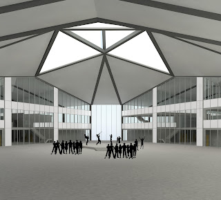
Render 2 - Unity Hall - Community Event - Notice the stage is in the up position


Render 3 - Unity Hall - Governance Event - Notice the stage is in the down position


Render 4 - Unified Capital as viewed from OGH at night


Render 5 - Sectional perspective - Governance Wing


Render 6 - Sectional perspective - Community Wing

Final Program

Area Schedule

Below are the approximate area calculations for the Unified Capital Building.

Design Drawings

Following are the design drawings for the Unified Capital Building

Site Plan 1:1000

Ground Level Floor Plan 1:200

First Level Floor Plan 1:200

Second Level Floor Plan 1:200

Long Section - Unity Hall 1:200

Entry Elevation 1:200

Materiality

Material selection is as per the image below.
Reason for selections as follows:
  • Coloured concrete floor - coloured concretes will be used for the ground floor throughout the building. Concrete is a durable material that will stand the test of time in this public building.
  • Steel portal frame - the will be used to express the form of the building both inside and out. Structurally it is the most efficient way to achieve my proposed building form, allowing the large free spans I am trying to achieve.
  • Translucent glazing - this material will allow significant penetration of natural light into the building. The material evokes a sense of permeability and will give users a unique experience each time they come to the building, due to the changing levels of sunlight. At night the building will become a symbol for the people of Western Sydney.
  • Copper roof - copper has been used for centuries as a material of choice for major public buildings, places of governance and worship. Therefore it is a familiar material for people from many places across the globe, contributing to the symbolism of the building. The copper will age gracefully and complement the translucent glazing.   

Provision for Building Services

Mechanical
The intent is that the community and governance wings have some mechanical ventilation and the unity hall has an entirely natural ventilation strategy. In light of this the community and governance wings have been allocated mechanical plant rooms for this equipment.

Electrical and lighting
The intent is that the electrical and communications systems in the community and governance wings rise through ducts and are distributed via an raised in floor system. In the unity hall an in floor system will also be used. For lighting and overhead fixtures, cabling etc. will rise via cladded portal frames.

Hydraulics
Water is intended to be supplied (waste removed) via ducts in the toilets. Toilets have been located directly on top of each other so this shouldn’t pose any issues. Roof water drainage will drain to corners of each portal via pitched roof and rainwater heads will be installed at each portal - such that they appear to be part of the portal structure.

Location of building services diagram

Circulation & Access Diagrams

Below are the circulation and access diagrams for the Unified Capital building.
Ground Level Circulation Diagram

Level 1 Circulation Diagram

Form Development & Resolution

Initial Sketches
The following sketches show the early development of my form, both in plan and elevation.

 Regular geometry exploration sketch 1


  Regular geometry exploration sketch 2


 Frame exploration sketch 1 - Lead to Test Model a below


Frame exploration sketch 2 - Lead to Test Model b below

 Early concept perspective sketch 1

Early concept perspective sketch 2


Physical Models

Test Model a
Below is my first test model, exploring how frames could achieve the transforming of my planning form into other dimensions.

Image 1


Image 2

Image 3

Test Model b
Further exploration of form through frames. This time I utilised an A-frame arrangement. I found the form that developed in this model to be much more powerful than test model a. However the practicalities in terms of space utilisation become apparent in this frame arrangement.


Image 1


Image 2


Image 3


Test Model a + b = C
I decided my best option was to pursue a form/frame arrangement that was a combination of both test model a and test model b. Below are sketches exploring this.

Frame consolidation sketch 1


Frame consolidation perspective sketch 2

Following this I constructed a third model: test model a + b = C. This model shows the progression of the design into a resolved form that is both aesthetically pleasing and practical in terms of spatial usability.

Image 1


Image 2

 Image 3


 Image 4


Image 5


Image 6 - Finished Model!


Image 7 - Finished Model!

Logistical Diagram

Expansion strategy
To allow for the expanding needs of the region, if future expansion of the building was required, additions could easily be made as per the diagram below.
Current Design


Future Expansion

Additional wings could be added, either for new functions or as expansions to the existing functions. This would be a relatively easy process, due to the use of a portal frame structural strategy (refer to Form Development & Resolution post). In this scenario the parti of the building would become strengthened through the additions to the tripartite axis.

Parti & Initial Program

Canberra Diagram

This map of Canberra shows the Parliamentary Triangle, the axial connection of Commonwealth, Kings and Constitution avenues, originally developed in the Walter Burley Griffin/ Marion Mahony Griffin plan for Canberra. This is one of the strongest parts of the plan.


The image of Parliament House below illustrates the symbolism that the Australian public associate with their National Capital.


Source: Flynn, M. (2009)
Parliament House Parti Diagram

Seen here is the cross axis parti diagram of Parliament House in Canberra.

My Parti Diagram

The quality of my architectural proposal will help facilitate a distribution of governance responsibility. The parti of my proposal is based off the need for a building that utilises a tripartite axial relationship between governance, community and the fusing of the two. This requires the following main three functional spaces:

·         Community wing containing: a regional creative centre - a place where public studio space is made available to all; a regional knowledge bank - place focused on the maintenance, development and history of the regions’ culturally diverse peoples.

·         Partial’ governance wing - with the relocation of the Western Sydney Regional Organisation of Councils office from Blacktown to Parramatta. The statutory organisation would become directly elected, rather than the current indirectly elected system. This will give WSROC more ability to positively influence the future of the Western Sydney region.

·         A UNITY hall - which is a cultural gathering place - performance space and meeting place, essentially a centre for cultural activities; and the place where committee meetings etc. of WSROC would be held. By overlapping the uses of this space, residents will be more likely to actively participate in the shaping of their future through attendance and contribution at committee and other meetings.
Initial Parti Diagram Options
Blue = Community Wing
Orange = Governance Wing
Green = Unity Hall

Final Parti Diagram
The tripartite axial parti additionally symbolises the building opening and welcoming the surrounding WSROC member councils, as they primarily lie to the north, south and west of Parramatta (with the exception of Bankstown which lies to the east but is more or less along the third axis - Geroge Street). My architectural proposal based on the above will strengthen the presence and identity of the place and its relationship to the National Capital. It will also strive to ensure the special needs of all social groups can be injected into governmental decision making - thus closing the current communication gap and contributing to the unification of the nation.  

Parliament House Program

Seen below is the program of Parliament House in Canberra, which allocates spaces as per the Parliament House parti diagram above.


Something that is instantly noticeable in this plan is that the public access is only from one place, the north entrance. Although the intention of the green that passes over the top is that it be used by the public, it is rarely the case.

My Initial Program

Subsequent to my strategy and parti, my initial program developed as per the following:
  • Community Wing = approx. 1/4 of total volume
  • Governance Wing = approx. 1/4 of total volume
  • Unity Hall = approx. 1/2 of total volume
These figures were developed to show that the overall building is to be equally shared between the community and the governance of the community.

Below are my bubble diagrams of the program.

Bubble Diagram 1 - Overall


Bubble Diagram 2 - Ground Level


Bubble Diagram 3 - Upper Level